
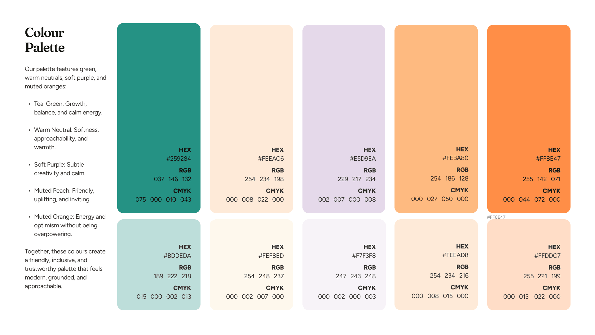
01 / Colours / Colour Palette
Tiny Seeds is Jersey's only fertility support charity. Founded from lived experience, the charity supports anyone facing fertility struggles: heterosexual couples, LGBTQ+ individuals, solo parents. They run support meetings, workplace toolkits, counselling, a podcast, and have distributed over £57,600 in travel grants for islanders accessing IVF treatment off-island.
One in six individuals face fertility struggles. That statistic shaped every decision we made on this project. The brand, the website, the campaign: all of it needed to meet people where they are, with clarity and sensitivity.
BBC Featured
Coverage
May 2026
Website Launched
£60,000+
Travel Grants Funded
500+
People Supported Yearly
Navigating complexity
Tiny Seeds came to us with a clear need and a difficult brief. Jersey's only fertility support charity, founded from lived experience, supports heterosexual couples, LGBTQ+ individuals and solo parents, anyone carrying the particular weight of fertility struggles. One in six people will face them. The existing brand and website did not reflect that breadth, and the community the charity had built deserved better.
The brief covered the whole public presence: a complete rebrand, a campaign microsite for Fertility Awareness Week, and a full website redesign and build. We scoped it as a phased engagement from brand discovery through to launch, with the same standard across strategy, design, build and handover.
The brief covered the whole public presence: a complete rebrand, a campaign microsite for Fertility Awareness Week, and a full website redesign and build. We scoped it as a phased engagement from brand discovery through to launch, with the same standard across strategy, design, build and handover.
We ran a brand discovery workshop with the Tiny Seeds team, campaign partner Iter Marketing, and branding partner Design & Animation. A brand questionnaire went out ahead of the session to surface the charity's own perspective on personality, tone and positioning before the room shaped anything.
Six traits came out of it: considerate, sensitive, brave, resilient, authentic and hopeful. Those became the filter for every visual and verbal decision that followed. The charity's vision, that by 2035 all islanders will feel supported, knowledgeable and empowered to help those facing fertility struggles, gave us a clear north star for the information architecture work ahead.
The previous identity used a visual language that did not represent the full spectrum of people Tiny Seeds supports. Working alongside Iter Marketing, who led the brand direction, we developed a gender-neutral identity built on organic patterns and considered forms. Multiple concepts were explored before one direction felt right.
The deliverables went beyond a logo and colour palette. Tiny Seeds received brand guidelines, Canva templates for social media, and Mailchimp email templates with marketing automation built in. Toolkit downloads, including workplace fertility resources for employers, are gated behind automated Mailchimp flows so anyone requesting materials receives the right follow-up without manual work from the team.
Brand system
01 / Colours / Colour Palette
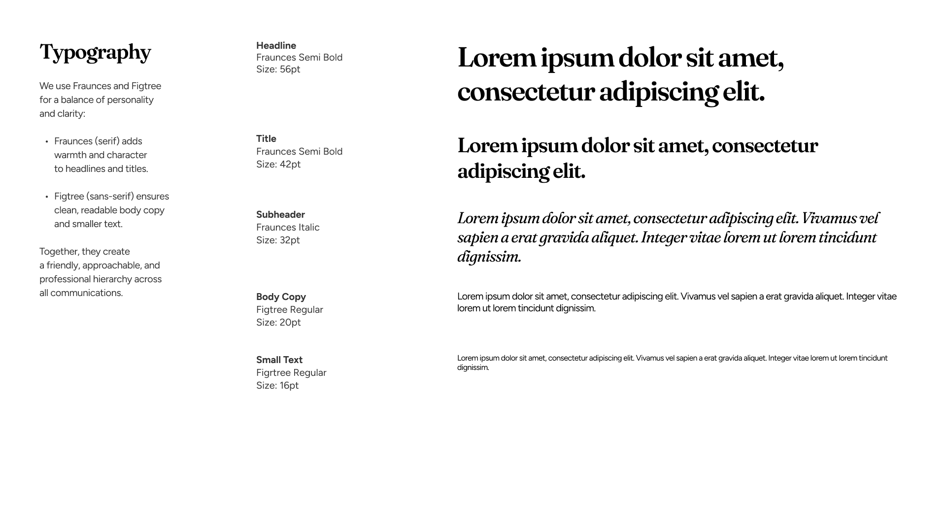
02 / Typography / Typography System
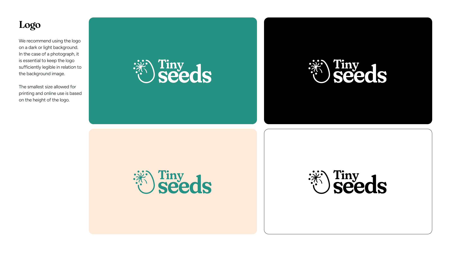
03 / Logo / Tiny Seeds Logo
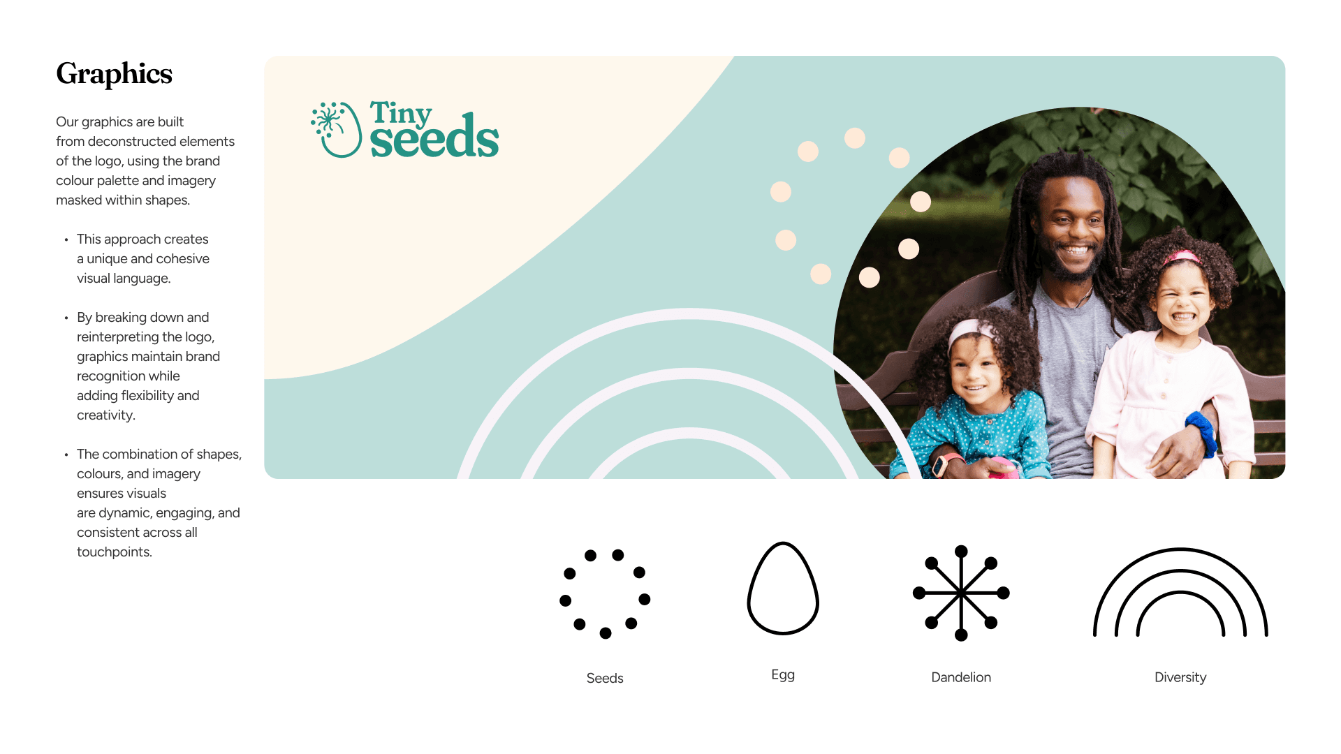
04 / Graphics / Graphics & Visual Language
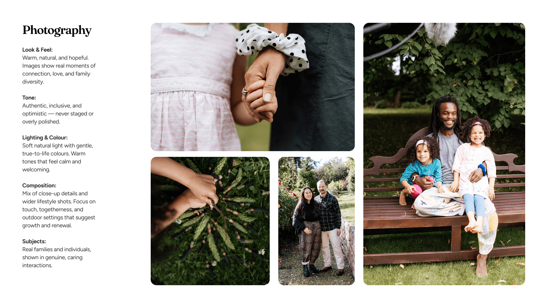
05 / Tyopgraphy / Photography
During Fertility Awareness Week, we built the Birds and Bees campaign microsite as the first public reveal of the new brand. Video stories and GSAP animations carried emotional weight without overwhelming visitors. Iter Marketing led on campaign production, content and media engagement. Ikigai handled the microsite build, animation and brand integration.
The Birds and Bees concept gave the campaign an accessible entry point to a subject most people find genuinely hard to talk about. It was featured by the BBC and picked up across local media, giving the charity a wider platform before the main website went live.
The existing site's structure created real usability problems. A single long page, anchor-based navigation and a mega menu listing every service and resource at once made the site harder to use than it needed to be. For someone arriving during a difficult moment in their life, that was the wrong experience.
We rebuilt the information architecture from the ground up into a hierarchical sitemap, giving each area of the charity its own space and navigation path. The animated mega-navigation was designed as a discovery tool, giving visitors an immediate view of the full breadth of support and information the charity offers.
Wireframes mapped the full structure. Figma carried the design. Webflow gave the team a content-managed site they can update without developer input which was an important requirement for the charity to ensure funds and costs could be kept for more important fundraising work.
For the build and QA process, we used Webflow MCP alongside a custom AI-powered launch workflow. That workflow runs automated checks across performance, accessibility, schema and content, making the launch process more rigorous without adding manual overhead and unnecessary cost to the charity.
The main Tiny Seeds website is now live at tinyseeds.je. It carries the charity's data clearly and credibly: IVF now accounts for around 1 in 13 babies born in Jersey, Tiny Seeds has funded 150 travel grants worth over £60,000 in three years, and the charity supports more than 500 people every year. Presenting that evidence well is part of how a small charity builds trust and makes the case for funding.
We roughly doubled the volume of content on the site and have already observed strong improvements in search engine visibility. The ongoing relationship is about refinement informed by real visitor behaviour as the project aims to support the long-term ambitions of the charity.

Chloe Fosse
Founder, Tiny Seeds
Share with your team or peers
All engagements start with a free 30-minute discovery call before anything is proposed or priced. No pitch deck. No pressure.
